Room4U – Mobile-First Website-Redesign
The Client
Room4U is a Swiss space-rental company offering secure storage units and flexible stay rooms (office, hobby/workshop, garage) across several urban locations.
Customers can use spaces for storing, working or creating during extended opening hours (06:00–24:00). Units are unfurnished, practical and fairly priced, with optional add-ons such as an internet line to the room.
The service targets downsizing households, start-ups and craftspeople with a simple process: light credit check, ID verification and an on-site visit before contract signature.
The Challenge
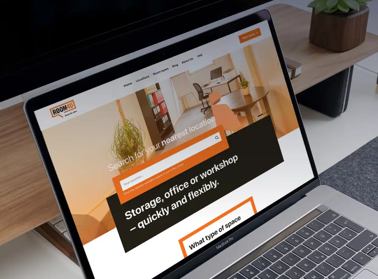
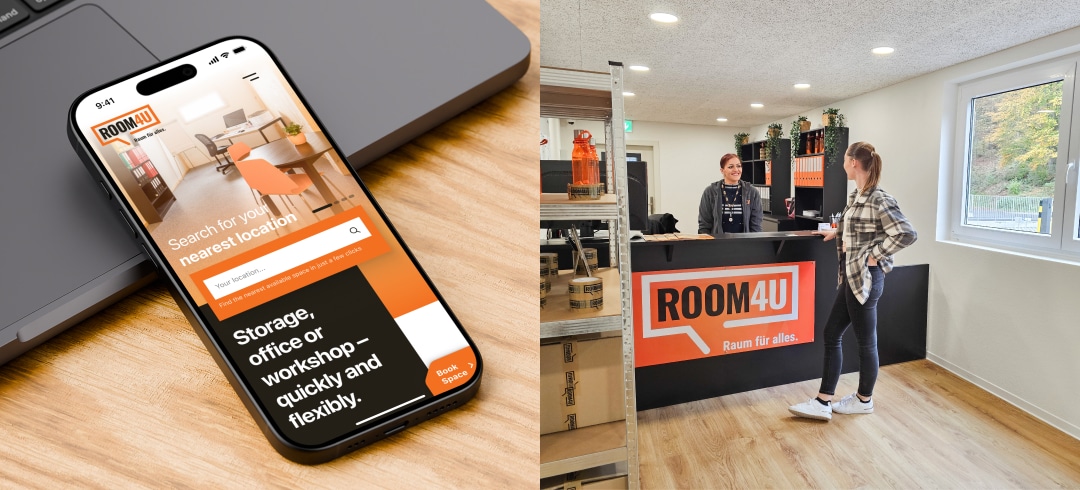
The previous website did not sufficiently reflect Room4U’s mixed offer of storage and stay rooms and was not sufficiently mobile-optimised.
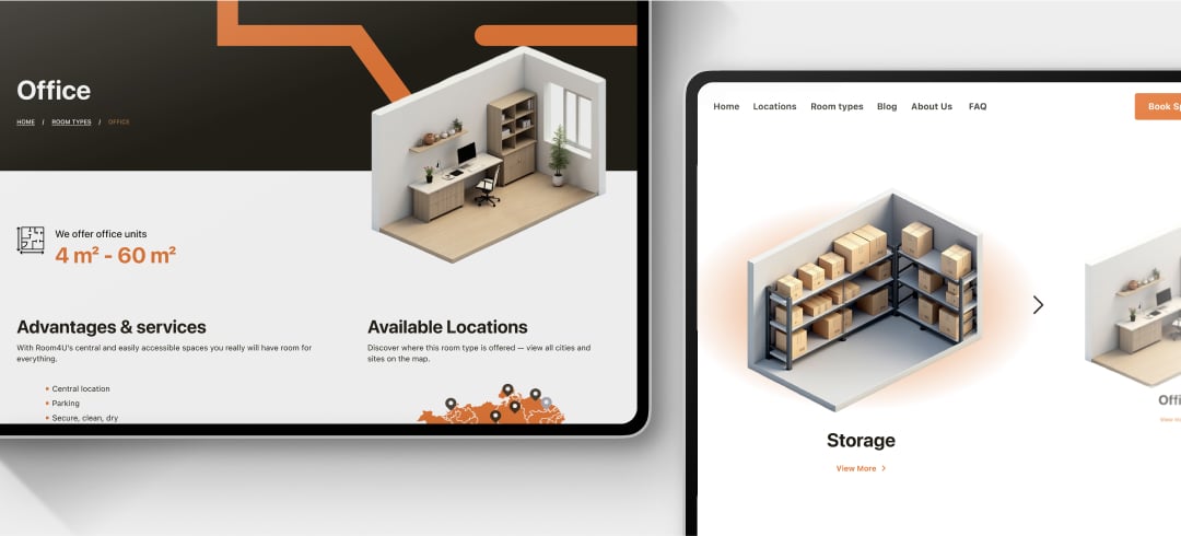
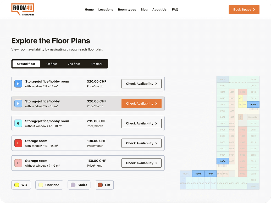
Users needed too many steps to reach an enquiry, and many struggled to distinguish administration vs viewing hours or to notice walk-in options and on-site payment. Interactive floor plans and 3D assets existed but were hard to find. Room sizes were abstract without clear length × width cues or human-scale references, and the Book Space call-to-action was not consistently visible. Navigation and footer patterns were uneven, which increased friction at the very moment users needed confidence to choose a space.
The Solution
Swiss Tomato re-designed the information architecture and interface with a mobile-first funnel and reusable components:
- Hero video/slideshow & direct paths: A lightweight visual hero introduces real spaces and leads straight to location search, room types and a sticky booking CTA.
- Interactive floor plans: Level switcher, colour legend and unit highlights; selecting a unit opens a modal with exact 3D preview, details (L×W, level, price if available) and Book/Enquire. This was already available in the previous website, but not as prominent.
- Real opening hours module: Side-by-side Admin vs Viewing times with expand/collapse for long schedules; map pins show key info via popups.
- Visual size guidance: Cards combine length × width with a human silhouette; room-type visuals calibrated (office appears larger, garage smaller) and a standard 3×6 m reference noted where relevant.
- Content structure & trust: Dedicated FAQ in the header (and footer), News (offers/events, no detail pages) anchored on About, Guide/Blog for tips with article pages.
- Accessibility & performance: Well-sized tap targets, strong contrast, keyboard-focusable controls and media fallbacks for fast mobile loads.

Results
The final web design is a modern, intuitive, mobile-first platform that combines great user experience with state-of-the art design. The users of the website can reach important information in 3 clicks and contact Room4U for booking.The modern, mobile-first web platform offers an intuitive, state-of-the-art user experience. Key information is easily accessible, requiring a maximum of three clicks, allowing users to quickly contact Room4U for booking.
